





-
23/05/2019
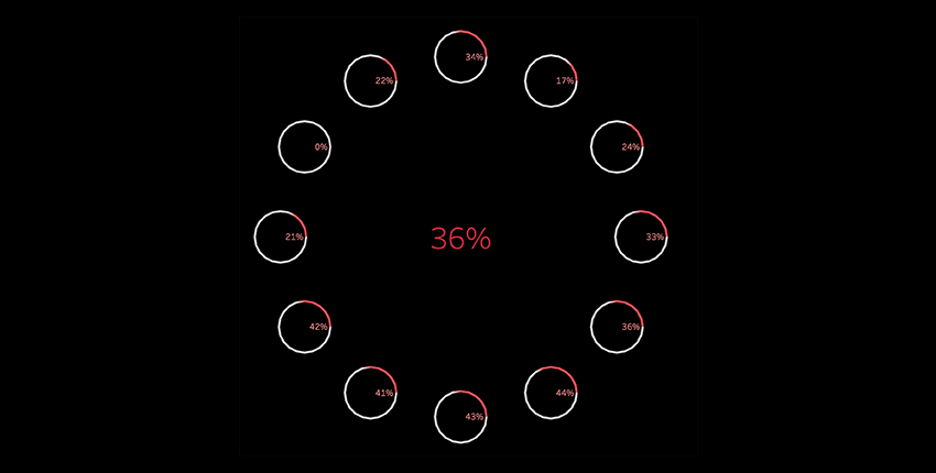
Lots of people ask me in trainings how to do Donut Charts. We do love donuts! With this Chart we can use a donut to compare data from each month compared with the yearly average, in order to obtain a quick insight.
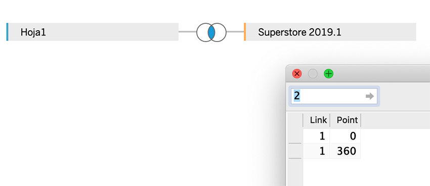
Using data from SuperStore and a template that we will use to densify in Tableau. (Create virtual data between 2 points creating bins)
The template would have this data. We would create a Link column en SuperStore to do the Join for this field.
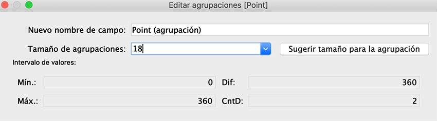
We create the Bin with the field point, with size 18. 20 points would be sufficient to create a circle for each Month.
Let’s use these dimensions, Sub-Category, Month(OrderDate) and the Bin

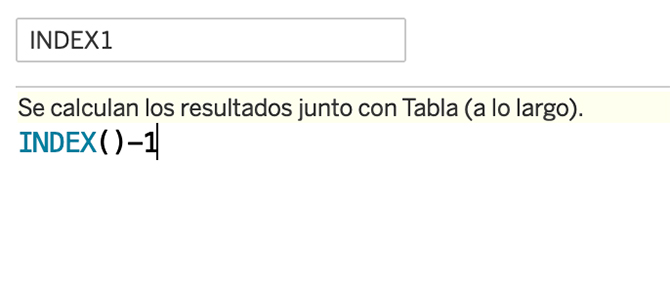
We create the first calculated field INDEX1, computed using Month(OrderDate)
We calculate the centre of each Donut for each month, using a parametre to be able to adjust the distances.
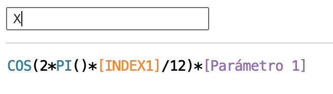
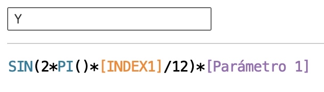
We create another INDEX2 field, this time computed using the Bin. With this, we will have 20 points in order to simulate a circle for each month.
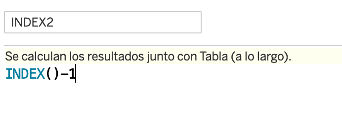
For each month, we will calculate 20 points of its circle,
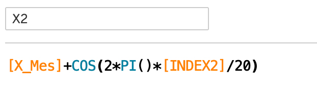
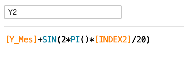
As soon as we have the points calculated, we will calculate the measures:
We create a calculated field LAST computed using the Bin
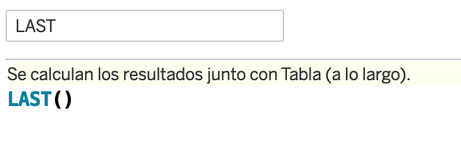
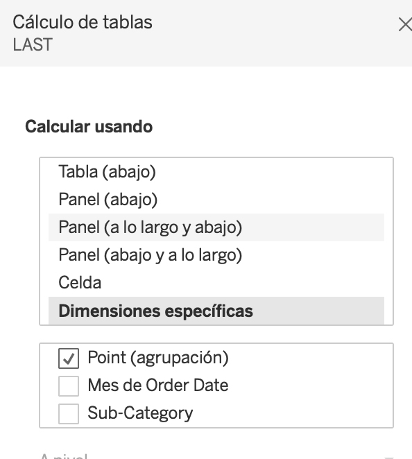
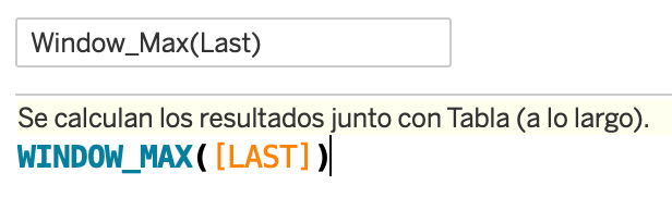
Take the highest value and assign to the rest of Panel, computed using the Bin
Create an Avance Calculated Field, that will allow us to generate different colors comparing with the measure to analyze
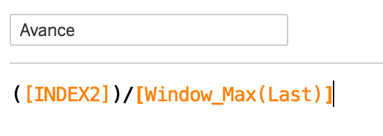
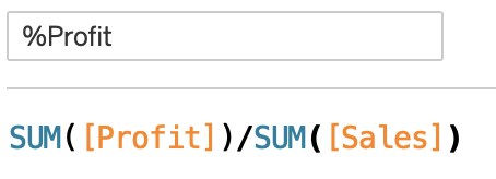
The measure to analyze will be this Calculated Filed; %Profit
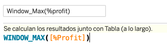
Take the highest value of the panel and assign it to the Panel
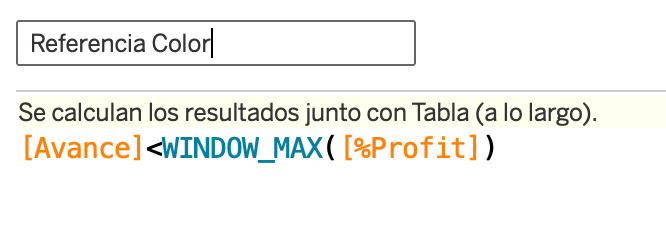
Compare them in order to have 2 colors in the Donut:
Before creating the View, review Tablea Calculations:
- INDEX 1, X e Y computed using Month (OrderDate)
- INDEX 2, X2 y Y2 computed using the Bin
- Last, WindowMax(Last) computed using the Bin
- Avance y % Profit computed using the Bin
At this point, we should have a table like this:
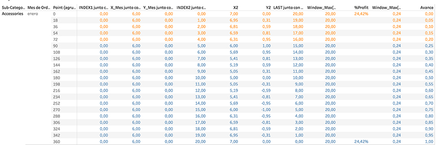
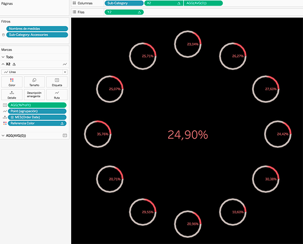
Now we duplicate the previous view and we build the visualisation as follows:
- X2 to Columns
- Y2 to Rows
- Type of Mark Line
- The Bin to Route
- Mes(OrderDate) to Detail
- Referencia Color to Color
- %Profit to Label
- Adjust the Size as you like!
Insert the general % Profit in the middle using a double axis AVG(0) and applying the preferred format:
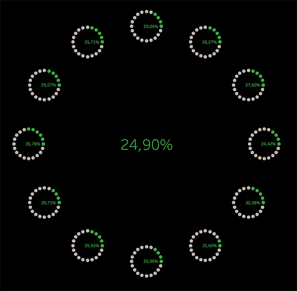
We can also change the type of marker to circles and get a Circles in Circle Chart as an alternative:
That’s all & Cheers!