





-
24/08/2019
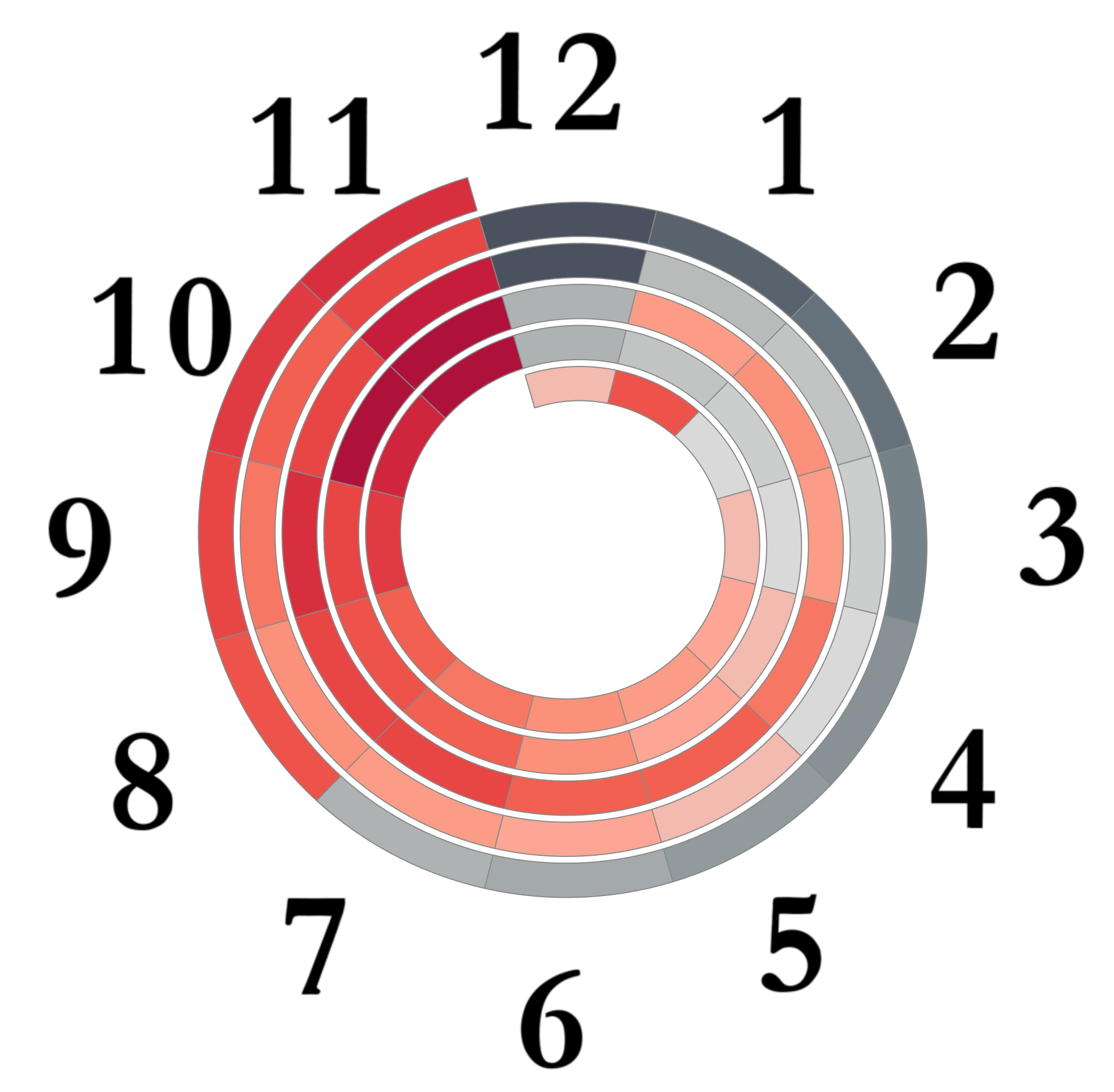
Do you like Heat Maps and have Time Based Data? Here’s a tutorial to build this Chart: Spiral Heat Map. Let’s build it with ClockWise and reverseClock Wise directions!
This is the DataSet we are going yo use: Number of calls from 12pm to 11pm during 5 days. Feel free to use your own data!
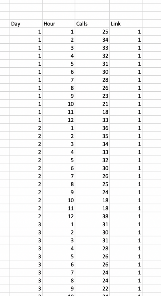
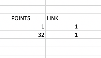
We will use a template to Join with the Data Set, to use densification. This will allow to create the polygon. 32 marks will be enough in this case to build each polygon
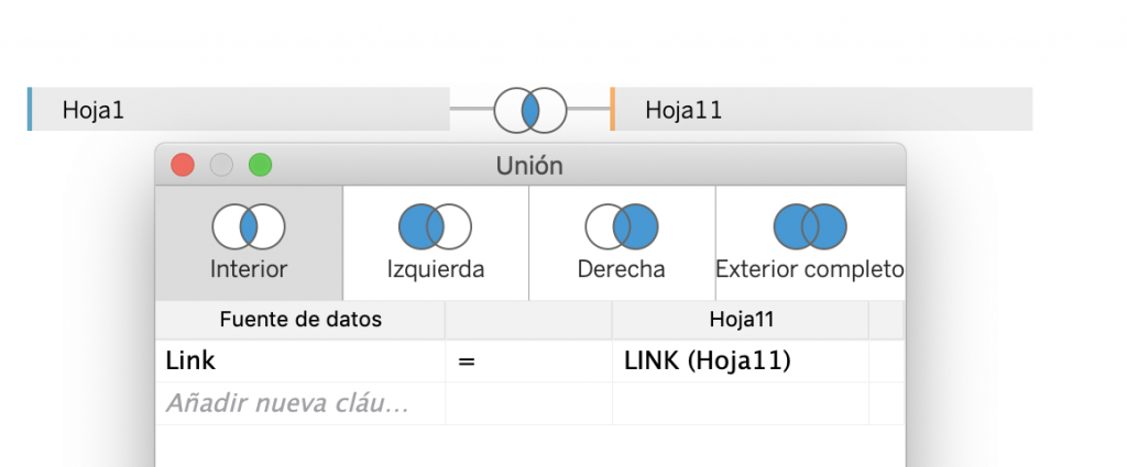
Let’s join them, using the common field Link:
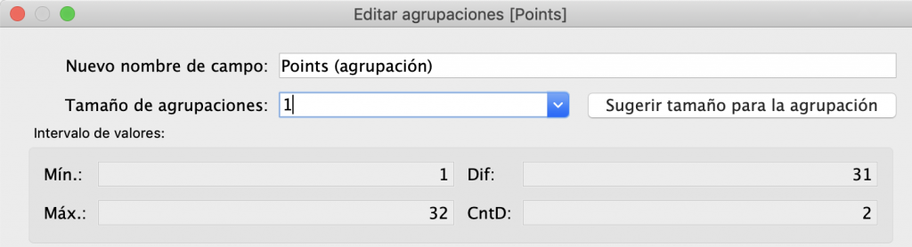
Start creating the Bin Point, with size 1:
Create the following Calculated Fields:
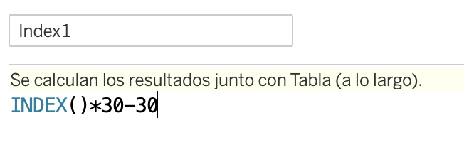
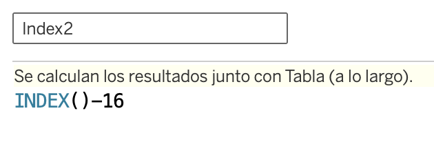
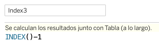
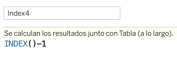
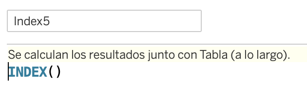
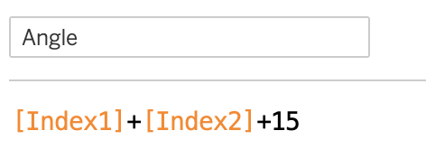
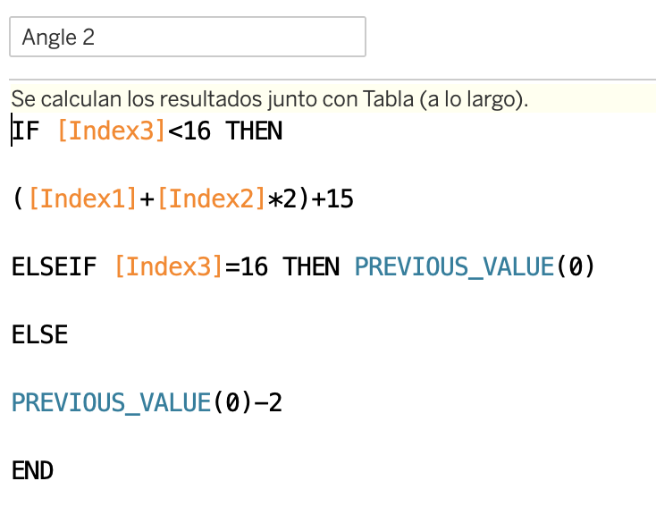
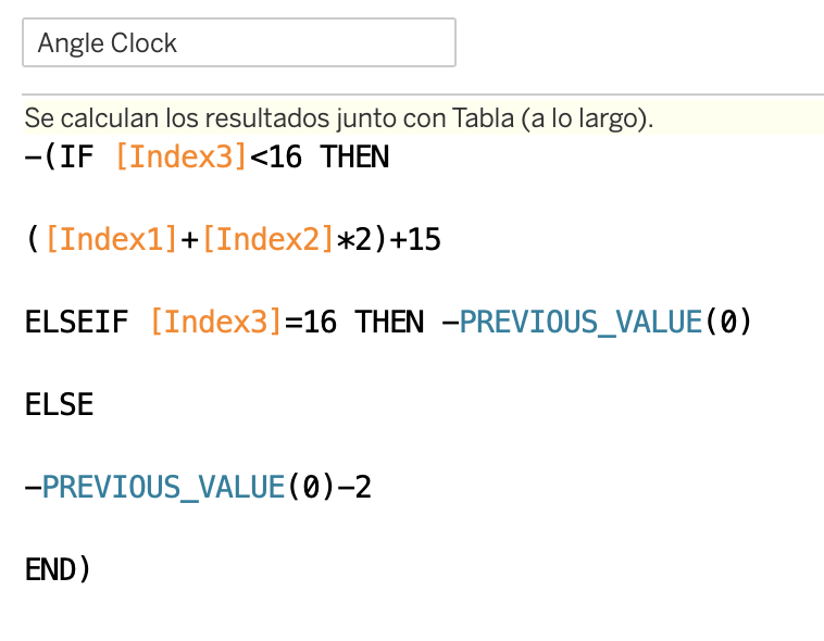
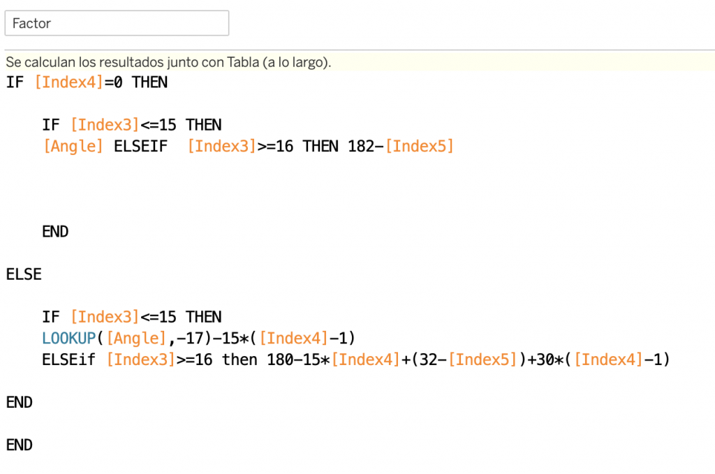
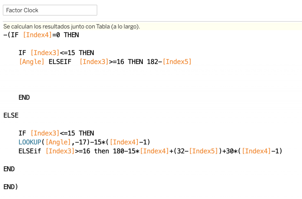
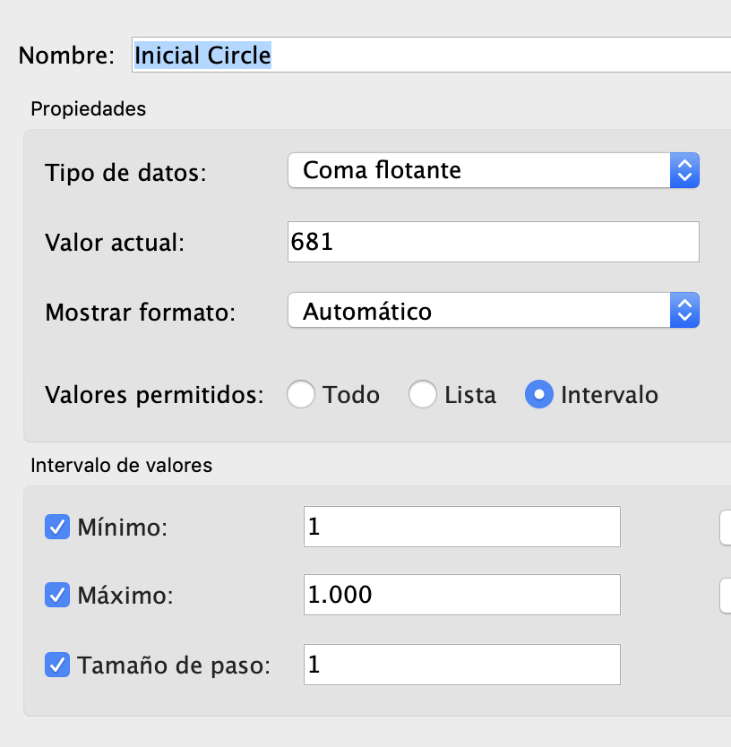
Create 2 new parameters to set the Gap and Circle inside the Spiral
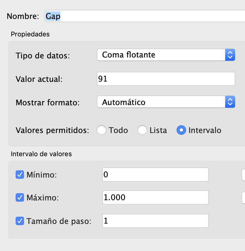
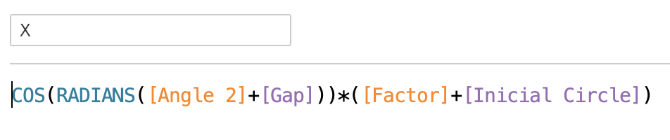
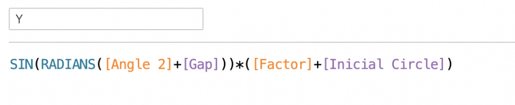
Create the X and Y Calculated Fields of each polygon:


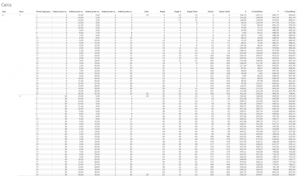
Drag the Dimensions Day, Hour and the Bin Points to Rows and all the new calculated fields to the view as text:

Check the Table Calculations
- Index1, Index4 computed using Day and Hour
- Index2, Index3 and Index 5 computed using the Bin Point
- Angle2, Angleclock, Factor and FactorClock computed using Day, Hour and the Bin Points
- Review the Nested Table Calculations for X, Y, XClockWise and YClockWise and configure each as described before.
At this point you should have this Table of Data and Calculations:
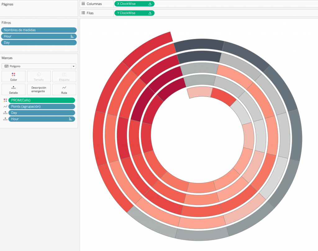
Duplicate the view and start building the Chart:
hen duplicate the Sheet to build the Visualization:
- XClockWise to Columns
- YClockWise to Rows
- Avg(Calls) to Color
- Set Marks Type to Polygon
- Bin Points to Route
- Day and Hour to Detail
- Show Parameters and Set Gap to 90 and Initial Circle to 600
NOTE: You can use X and Y instead of XClockWise / YClockWise if you want a inverse ClockWise Chart.
Sort the Hours:
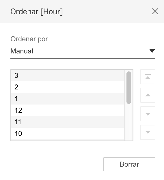
Finally, Format according your preference!
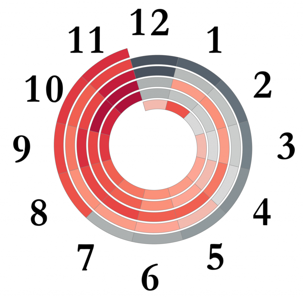
You can use a background image to view the Hours:
That’s all and Cheers!