





-
08/06/2019
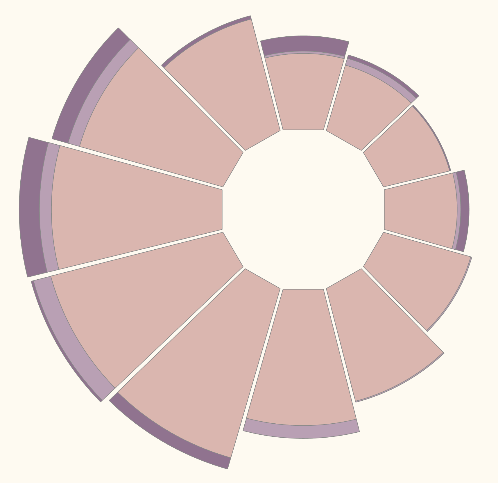
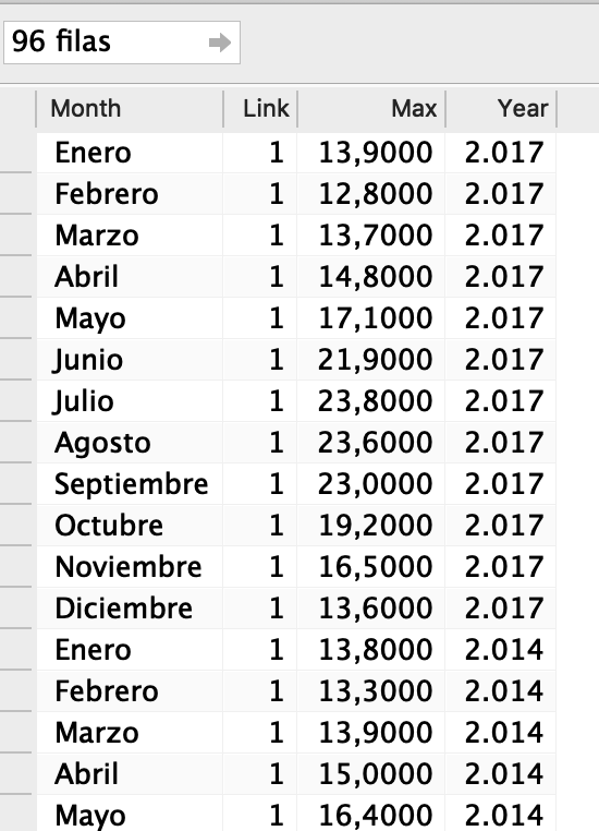
Let’s build this chart in Tableau! We are going to visualize monthly the changes of sea max temperatures along different years, using this Data Set. Rename Max to Temperatura. This will be the KPI to Visualize.
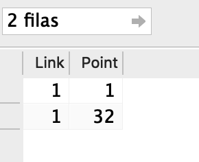
We will use a template to Join with the Data Set, to use densification. This will allow to create the polygon.32 marks will be enough in this case to build it.
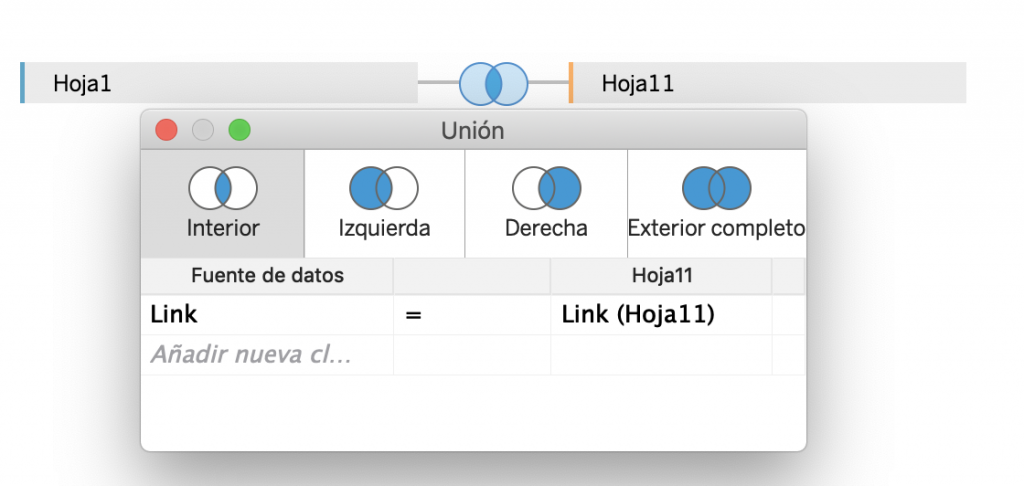
Let’s join them, using the common field Link:
Start creating the Bin Point, with Size 1
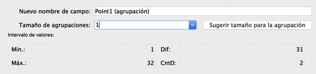
We are going to use these dimensions. Drag them to Rows:

and start creating 2 Calculated Fields, INDEX1, computed using Month and INDEX2, computed using the bin:
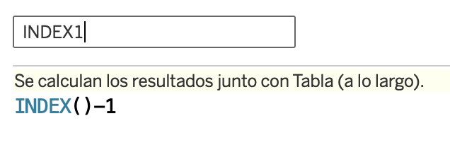
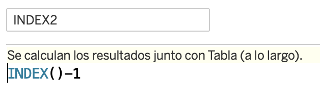
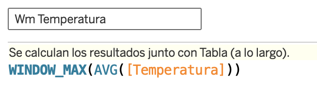
Drag AVG(Tempatura) to the View and create another Calculated Field Wm_Temperatura, computed used the bin:
Create 2 news Calculated Fields X and Y to build the Polygons, where point 0 and 32 will be the base of every cheese portion, and from 1 to 31 will be the arc of that polygon. Leave 1 grade to create an space between the polygons. We use a parameter 1 to adjust the circle of the donut:


Check the Table Calculations
- INDEX2, X, Y and Wm_Temperature computed using the Bin
- INDEX1 computed using Month
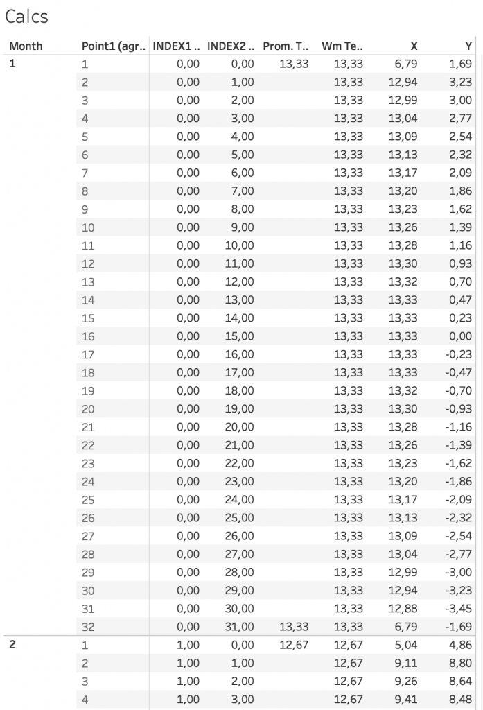
At this point you should have this Table of Data and Calculations:
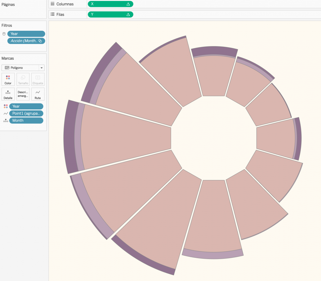
Then duplicate the Sheet to build the Visualization.
- X to Columns
- Y to Rows
- Type of Mark Polygon
- Month to Detail
- Bin to Route
- Year to Color
- Show parameter 1
Finally, Format according your preference!
That’s All and Cheers!