






-
23/05/2019
I thought about this 360º chart as an option to visualise all of the transactions in one or in various years, using the number of days in the year corresponding with a degree of a circumference.
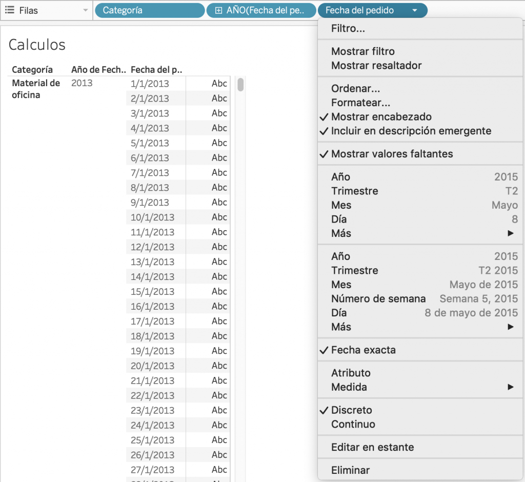
We are going to use the dimensions of SuperStore: Category, Year OrderDate and again, Order Date as Discrete showing the missing values, as follows:
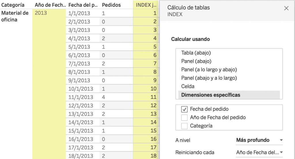
We create an INDEX calculated field computing using the discrete Date Fecha del Pedido, restarting every YEAR. In this way, we will have a value from 1 to 365 for each day, even if there were no transactions.
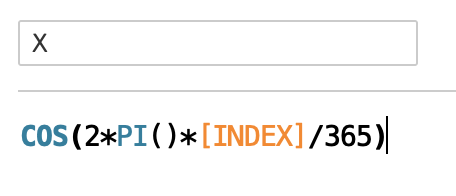
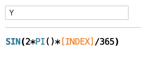
We want to visualise each day as a point on a circumference, by using INDEX. Let’s create X and Y Calculated Fields:
We can take SUM (Sales) to Size in order to visualise those dates with the highest Sales. To improve this visualisation, we are going to use the Random() function, which allows us to generate a number between 0 and 1 at random. We will use this to displace each mark at random around their point in order to see this with more clarity.
we have already used in detail.
We build this visualisation by dragging X to columns and Y to rows, using Order Date Year in colour, and the order date and INDEX that
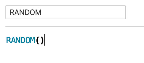
We can also create a parameter to give more or less weight to the Random() function, and we can modify the X and Y measures to work with whichever grid we find.
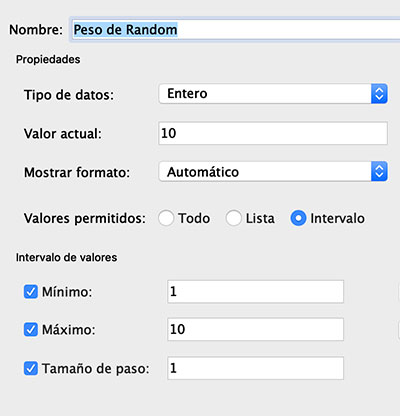
Cretae the X2 and Y2 Calculated Fields using the Random() Function and the Parameter
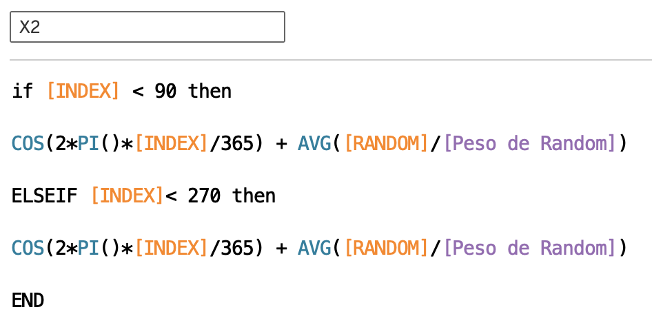
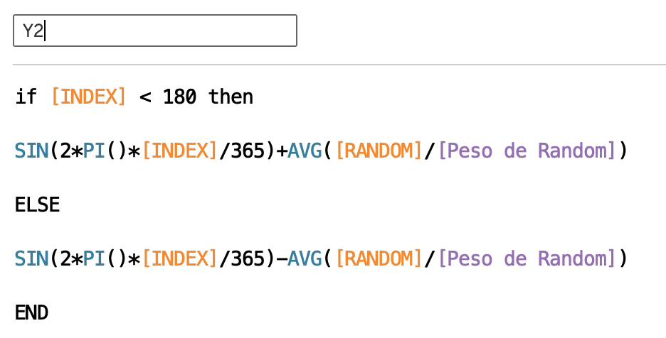
Review the Table Calculations:
- X2, Y2 and INDEX computed used Fecha del Pedido restarting every YEAR
At this point you should have a Table as this one:
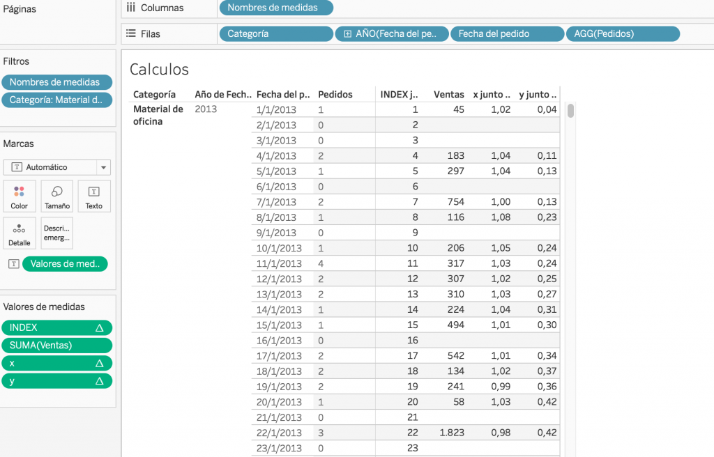
Create a duplicate of your Sheet and start building your View:
- X2 to Columns
- Y2 to Rows
- Type or Mark Circle
- Fecha del Pedido to Detail
- AÑO(Fecha del Pedido) to Color
- SUM(VENTAS) to Size
- Filter 2 years
Lastly, we format the colours to keep it in the style that we prefer!
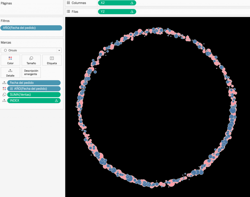
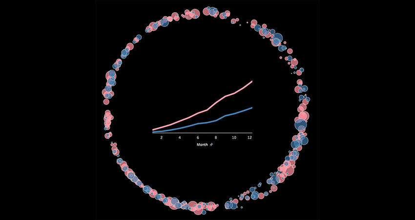
We can complement the visualisation by creating a temporary view with the accumulated sales in the year, to reinforce the insight.
That’s all & Cheers!